A blank wall can make even a beautifully furnished room feel unfinished. The right picture frame wall ideas can completely change that impression, turning an ordinary surface into a carefully designed focal point filled with personality, warmth, and visual depth. More importantly, a sophisticated frame arrangement does not require an enormous art collection or an expensive renovation. The transformation often comes from choosing the right composition, frame finishes, artwork, spacing, and relationship between the gallery and the furniture around it.
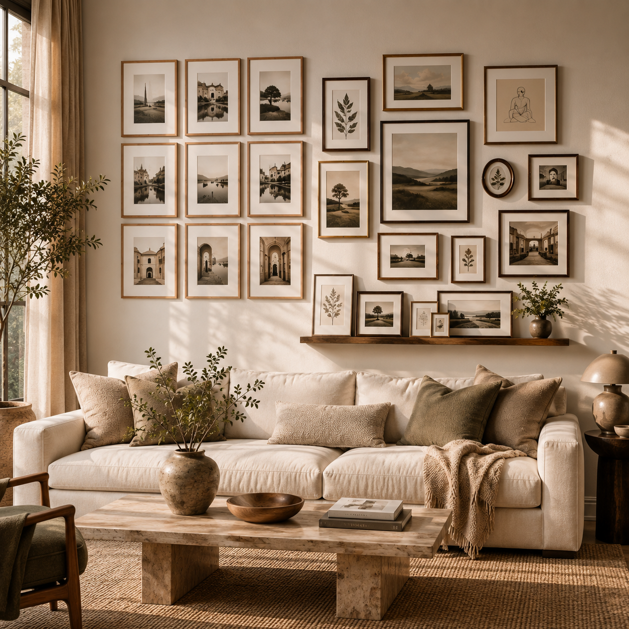
Modern picture frame walls have also evolved far beyond randomly hanging family photographs across an empty wall. Today’s most inspiring arrangements borrow ideas from professional gallery installations, boutique hotels, collected European interiors, contemporary apartments, and relaxed designer homes. Frames can be perfectly aligned for architectural precision, deliberately mixed for an organic collected effect, or layered along a picture ledge for maximum flexibility.
The challenge is deciding which direction works best for a particular room. Too many frames can create unnecessary visual noise, while an arrangement that is too small may disappear on a large wall. The solution is to treat the entire wall as one composition rather than thinking about every frame individually.
Among countless possibilities, three approaches stand out because they offer dramatically different aesthetics while remaining practical enough for real homes. 🥇 A structured grid delivers polished gallery-like sophistication. 🥈 An organic collected wall creates warmth and personality. 🥉 A layered picture ledge offers relaxed flexibility that can continuously evolve.
Here are the Best 3 Picture Frame Wall Ideas worth considering when an empty wall needs much more character.
Why Picture Frame Wall Ideas Can Completely Transform a Room
Wall decoration occupies a surprisingly large percentage of what the eye sees when entering a room. Furniture may establish function, but walls often determine whether the space feels complete.
A well-designed picture frame arrangement creates a visual destination. Instead of the eye wandering across an empty surface, it is immediately drawn toward a deliberate composition. This effect becomes particularly powerful above sofas, consoles, beds, dining benches, desks, and sideboards because framed artwork visually connects the furniture with the architecture surrounding it.
Picture frames also introduce materials that can repeat elements already present elsewhere in the room. Warm oak frames can echo wooden furniture. Slim black frames can connect with steel windows or dark lighting fixtures. Antique brass frames can complement hardware and decorative objects. Cream or white frames can visually disappear into pale walls, allowing the artwork itself to become dominant.
This repetition makes the room feel more intentional.
Another advantage is scalability. A frame wall can occupy a tiny section of a hallway or stretch almost from floor to ceiling across a dramatic living room. The same basic principles—balance, proportion, spacing, and color harmony—can work at almost any scale.
Most importantly, picture frame walls allow personality to become part of the interior design. Travel photographs, illustrations, abstract art, vintage prints, botanical drawings, architectural sketches, family photographs, and meaningful objects can all become part of the composition.
The result does not have to look like a museum. It simply needs enough structure to make the collection feel intentional.
Quick Comparison of the Best 3 Picture Frame Wall Ideas
Before choosing a layout, it helps to understand how differently these three approaches behave visually.
| Picture Frame Wall Idea | Overall Style | Best Location | Difficulty | Flexibility | Visual Effect |
|---|---|---|---|---|---|
| 🥇 Structured Gallery Grid | Clean and sophisticated | Living room, dining room, hallway | Medium | Moderate | Architectural and polished |
| 🥈 Organic Collected Gallery Wall | Warm and personal | Living room, staircase, bedroom | Medium–High | High | Layered and characterful |
| 🥉 Layered Picture Ledge | Relaxed and modern | Bedroom, office, living room | Easy | Very High | Casual and effortlessly curated |
None of these options is universally better than the others. The best choice depends on whether the room needs order, personality, or flexibility.
A minimalist contemporary interior may benefit from the disciplined geometry of a grid. A warm eclectic home may look more convincing with frames collected in different sizes and finishes. A rental apartment or frequently updated room may benefit most from a ledge where artwork can be rearranged without repeatedly drilling new holes.
That difference leads directly to the first—and perhaps most timeless—approach.
🥇 Best 1 Structured Gallery Grid Picture Frame Wall Ideas for Timeless Elegance
Few picture frame wall ideas create such an immediate sense of sophistication as a perfectly organized gallery grid.
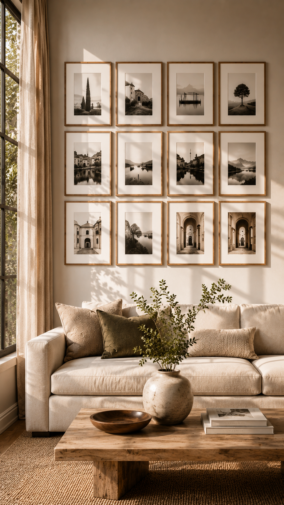
The concept is beautifully straightforward: select frames with identical or closely coordinated dimensions and arrange them in precise horizontal and vertical rows. The repetition transforms individual pictures into one larger architectural feature.
Instead of noticing twelve separate frames, the eye initially reads one unified rectangle.
That is exactly why grids look so powerful.
Why a Structured Picture Frame Wall Looks So Expensive
Luxury interiors frequently depend on repetition. Repeated wall panels, identical windows, evenly spaced lighting fixtures, and symmetrical architectural details naturally create visual order.
A gallery grid uses the same principle.
Imagine nine slim walnut frames arranged in three rows above a long cream sofa. Each contains a softly toned black-and-white architectural photograph surrounded by a generous ivory mat. The artwork may be simple, yet the overall composition feels substantial because every element follows the same visual system.
Matting is particularly important here.
A wide mat creates breathing room around smaller artwork and gives inexpensive prints a much more refined appearance. Rather than filling every frame edge-to-edge, allow negative space to become part of the design.
Cream, warm white, and soft ivory mats tend to feel slightly warmer than stark bright white, especially in rooms featuring oak, linen, travertine, limestone, or other natural materials.
Choose Frames That Connect With the Interior
The frame finish should not be selected independently from the room.
For contemporary spaces, narrow black metal frames can provide graphic definition without becoming visually heavy. They work particularly well with white, greige, taupe, concrete, and pale wood interiors.
Natural oak creates a softer effect. It is excellent for Scandinavian, Japandi, organic-modern, and warm minimalist interiors because the wood grain introduces subtle texture while maintaining simplicity.
Dark walnut feels richer and more traditional. Against warm beige or creamy walls, it can create beautiful contrast without the severity of black.
For an especially quiet effect, consider frames that closely match the wall color. Warm-white frames against an ivory wall allow the artwork and shadows to create the detail.
The important principle is repetition. Whatever frame style is selected, maintain consistency throughout the grid.
Get the Spacing Right
Spacing is where many grid arrangements lose their impact.
Large inconsistent gaps make individual frames feel disconnected. Extremely tight gaps can make the composition feel crowded.
A practical starting range is approximately 5–8 cm or 2–3 inches between frames, although the exact spacing should respond to frame size and overall wall dimensions.
Consistency matters more than the precise number.
If one horizontal gap is 6 cm, the next should also be 6 cm. The same applies vertically.
Painter’s tape can be extremely useful before installation. Mark the complete outer boundary of the planned arrangement and then mark the individual frame positions. Step across the room and evaluate the overall proportion before making holes.
Important Note: Always plan the complete outer dimensions of a picture frame wall before hanging the first frame. A perfectly spaced arrangement can still look wrong if the entire composition is too small or too large for the furniture and wall beneath it.
The Best Artwork for a Gallery Grid
Consistency does not mean every image needs to be identical.
Instead, look for a common visual thread.
A collection of monochrome architectural photography can work beautifully. So can muted landscapes, botanical studies, minimalist line drawings, vintage travel photography, or softly colored abstract compositions.
Family photographs can also look extremely sophisticated when edited into one consistent treatment, such as warm black-and-white or subtle sepia.
The goal is visual rhythm.
For example, nine photographs could alternate between close-up architectural details, wider landscapes, and abstract textures while sharing the same muted color palette. This creates variety inside a controlled framework.
The combination of uniform frames + consistent mats + related artwork + precise spacing is what makes this picture frame wall idea so timeless.
Where the Structured Grid Works Best
The grid is particularly effective above furniture with a strong horizontal line.
A long sofa is an obvious candidate. So is a dining-room sideboard, bedroom headboard, hallway console, or built-in cabinet.
It can also transform a transitional area. A wide hallway filled with an evenly spaced series of photographs immediately feels more considered and architectural.
For a narrow vertical wall, turn the concept around. Two columns of four frames can emphasize ceiling height and make the architecture appear taller.
The layout is controlled, but it does not have to feel cold. Warm materials and personal imagery can soften the geometry beautifully.
🥈 Best 2 Organic Collected Picture Frame Wall Ideas for Character and Personality
The second approach abandons perfect symmetry without abandoning thoughtful design.
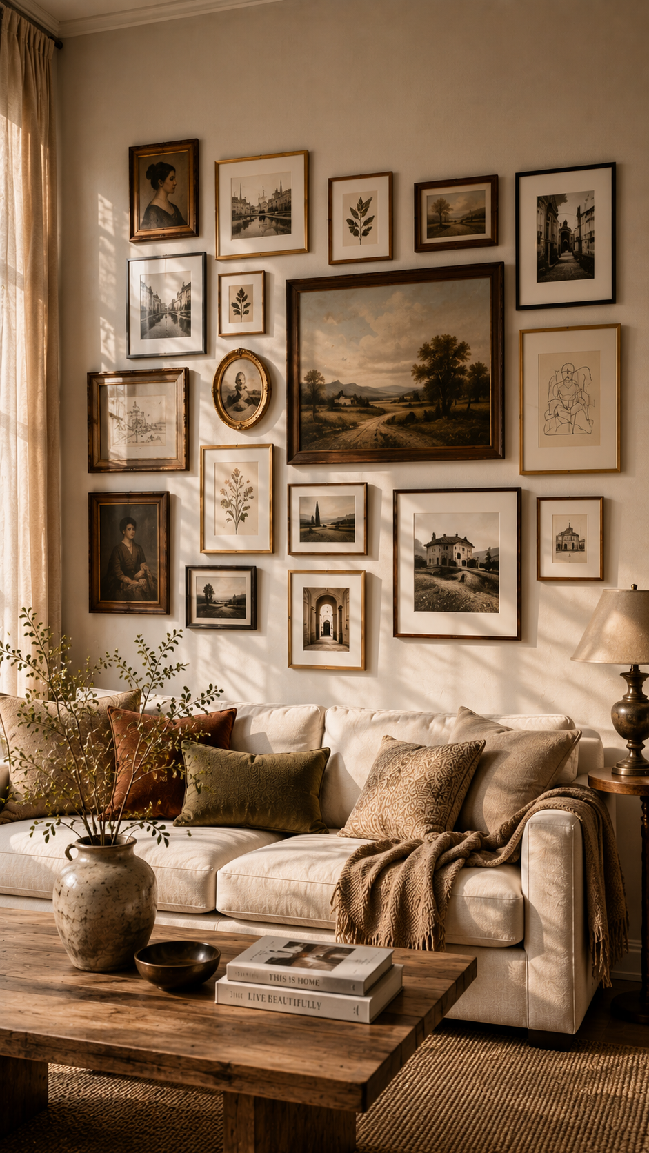
An organic collected picture frame wall combines different frame sizes, orientations, artwork types, and sometimes different frame materials into one carefully balanced arrangement.
Done poorly, it looks chaotic.
Done well, it looks as though an interesting collection has developed naturally over many years.
That sense of history is its greatest strength.
The Secret Is Controlled Imperfection
An organic gallery wall should never look mathematically perfect. At the same time, it should not actually be random.
Successful arrangements usually have hidden visual anchors.
One large artwork might occupy the center. Two medium pieces may balance opposite sides. Several smaller frames fill gaps and create transitions between them.
The viewer notices variety, but underneath that variety is a deliberate hierarchy.
Start with the largest or most important piece.
This could be a dramatic vintage landscape, oversized photograph, abstract painting, or meaningful family image. Position it slightly away from the exact center if a more relaxed appearance is desired.
Build outward from there.
Instead of creating perfectly straight rows, allow edges to shift. A vertical frame might sit beside two smaller horizontal frames. A tiny oval frame could occupy an otherwise awkward gap. A larger piece can extend slightly higher than the others.
This irregularity gives the arrangement life.
Mix Frame Finishes Without Losing Cohesion
One of the most exciting features of this style is the opportunity to combine different materials.
A sophisticated collection might include warm walnut, antique brass, dark wood, thin black metal, and one or two aged gold frames.
The mistake is introducing too many unrelated finishes.
A better strategy is to choose two dominant finishes and one occasional accent. For example, most frames could be walnut and black, with antique brass appearing only twice.
Another option is to unify different frame styles through artwork color.
If every image contains muted brown, olive, charcoal, cream, and faded terracotta tones, the collection can remain harmonious even when the frames differ considerably.
Texture becomes especially valuable here.
A weathered vintage wooden frame can sit beside a smooth contemporary brass frame precisely because the contrast adds history and depth.
Combine More Than Traditional Artwork
The most memorable organic picture walls rarely contain only conventional photographs.
Try combining several visual formats.
A vintage botanical print can sit beside a modern abstract painting. A small landscape photograph can balance an old architectural sketch. Textile fragments, pressed flowers, postcards, handwritten notes, small maps, or dimensional keepsakes can also be framed.
This approach makes the wall feel personal rather than purchased as a complete matching set.
Even inexpensive material can look elevated when presented carefully. A beautiful page from an old botanical book, a meaningful handwritten recipe, or a simple monochrome photograph can become surprisingly powerful once properly framed and integrated into a larger collection.
The key question is not, “Does every artwork match?”
Instead ask, “Does every artwork belong to the same visual story?”
Create a Color Story
Color is one of the easiest ways to connect seemingly unrelated artwork.
Suppose the room already features an oatmeal sofa, dark walnut coffee table, olive cushions, and warm off-white walls.
The gallery could repeat those colors through faded landscapes, botanical artwork, sepia photography, and subtle abstract pieces. Tiny touches of burgundy or rust could then provide richer accents.
Because those colors appear repeatedly, the eye perceives cohesion.
For a brighter interior, the same principle works with blue, sage, blush, terracotta, or mustard.
The palette does not need to be monochromatic. It simply needs enough repetition to prevent every frame from competing independently.
Use Negative Space as Part of the Composition
One common mistake with organic gallery walls is trying to fill every empty gap.
Negative space is essential.
Small areas of visible wall separate clusters and give individual pieces room to breathe. Without these pauses, a large gallery wall can quickly become visually exhausting.
Stand far enough away to evaluate the arrangement as one shape.
Does one side feel unusually heavy?
Is there an awkward empty area that looks accidental?
Are all the largest pieces clustered together?
A good organic gallery wall should have visual movement without appearing as though it is sliding toward one side.
Perfect Rooms for an Organic Picture Frame Wall
Living rooms are particularly suited to this style because they naturally contain multiple materials and decorative objects.
A collected gallery above a linen sofa can introduce enough detail to balance otherwise understated furniture. Add a sculptural floor lamp, textured cushions, natural wood, and ceramics, and the wall becomes part of a larger layered environment.
Staircases are another excellent location.
Instead of forcing artwork into a horizontal rectangle, allow the arrangement to gradually rise with the stairs. This makes use of a wall that is often difficult to decorate while naturally guiding the eye upward.
Bedrooms can benefit too, especially when the desired atmosphere is relaxed rather than formally symmetrical.
An irregular collection above a dresser often feels more effortless than a perfectly centered artwork.
This is ultimately the most expressive of the three ideas. It allows a room to tell a story through objects accumulated over time.
🥉 Best 3 Layered Picture Ledge Wall Ideas for Effortless Flexibility
Not everyone wants to measure and permanently hang fifteen individual frames.
That is where the layered picture ledge becomes especially useful.
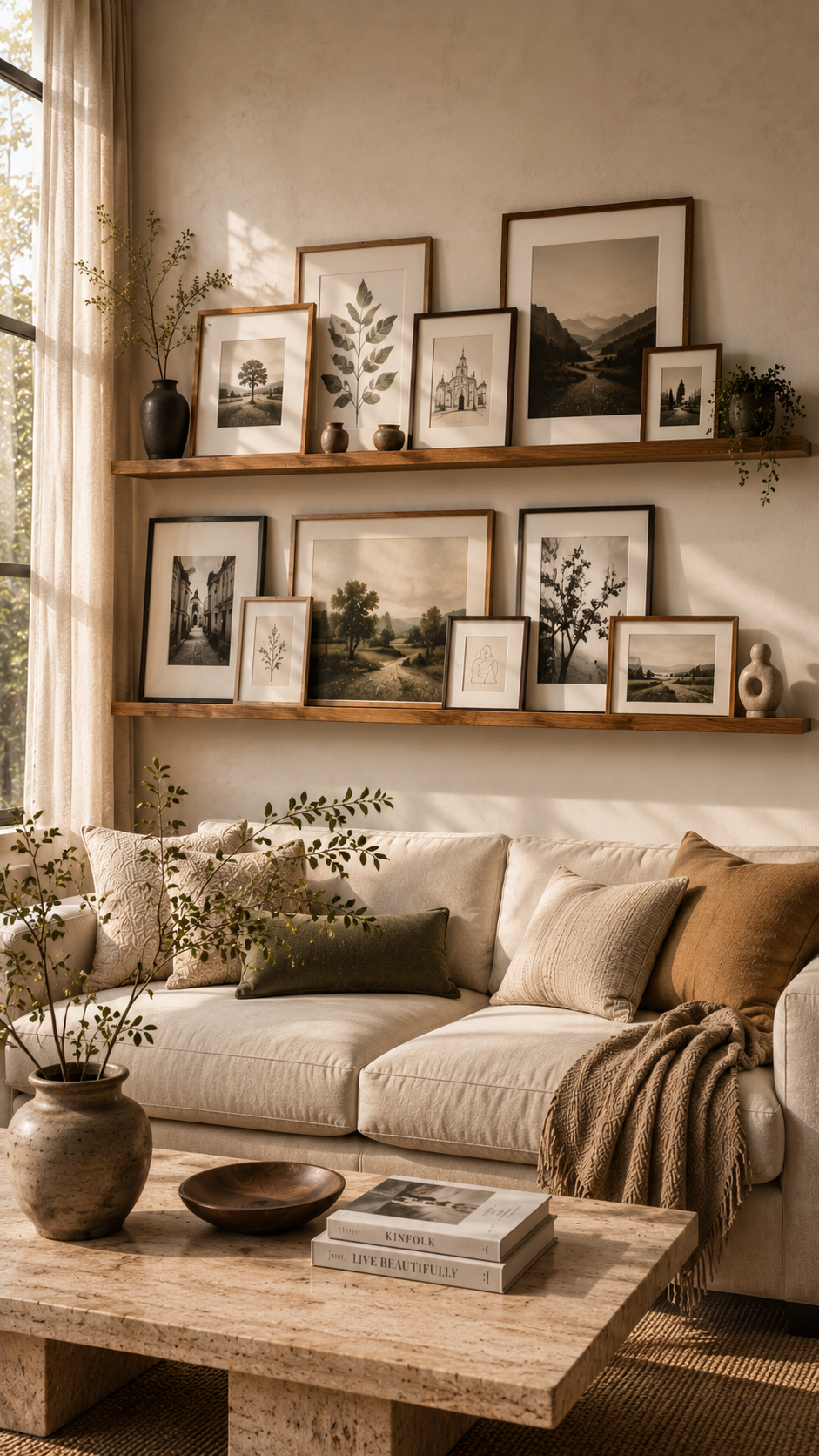
Instead of attaching every frame directly to the wall, install one or more shallow shelves specifically designed to hold framed artwork. Frames can then rest on the ledge, overlap slightly, and be rearranged whenever desired.
The result feels relaxed, modern, and surprisingly sophisticated.
Why Picture Ledges Are So Practical
Traditional gallery walls require commitment.
Moving one frame can disturb the spacing of everything around it. Replacing a small artwork with a larger piece may require new holes and a completely different layout.
A ledge removes much of that problem.
Once the shelf is securely installed, artwork can be moved repeatedly without altering the wall.
This makes the approach ideal for anyone who enjoys seasonal styling, photography, collecting prints, or regularly refreshing a room.
It can also be useful in children’s spaces where artwork naturally changes over time.
The freedom to experiment is one of its greatest advantages.
Layer Frames Instead of Lining Them Up
The most important styling technique is overlap.
If ten frames are placed side by side with equal gaps, the ledge can look like retail display shelving.
Instead, create depth.
Place a large frame toward the back and partially overlap its lower corner with a smaller frame in front. Introduce another medium frame slightly farther along the shelf. Leave some empty areas between groups.
This creates foreground, middle ground, and background within an extremely shallow space.
Varying heights also helps.
A tall portrait-oriented frame might become the anchor. A medium landscape piece can overlap it, while a tiny square frame creates a final detail.
Think of the arrangement as a skyline rather than a straight line.
One Long Ledge or Multiple Rows
A single long ledge creates the cleanest effect.
Above a sofa, for example, one slim oak shelf extending across much of the furniture width can support a relaxed collection of artwork. Because the shelf itself establishes a horizontal line, the frames above can be much more varied.
Two ledges create additional display space.
They can be stacked vertically with enough separation for taller artwork. Avoid positioning identical frames directly above each other; stagger them so the arrangement feels dynamic.
Three or more ledges can create an almost library-like display wall, particularly in an office, creative studio, or family room.
However, more shelves also mean more visual information.
For a calm living room or bedroom, one or two are usually enough.
Coordinate the Ledge With the Architecture
The ledge itself becomes part of the room, so its material matters.
Natural oak looks beautiful in warm contemporary spaces and can connect visually with flooring or furniture.
Painted white ledges almost disappear against white walls, creating the illusion that the artwork is floating.
Black ledges provide strong graphic contrast and work especially well with monochrome frames.
For a luxurious built-in effect, paint the ledge exactly the same color as the wall. Deep olive, mushroom, warm taupe, charcoal, or muted clay can make both the shelf and artwork feel integrated into the architecture.
This technique is particularly striking when the entire wall has a rich saturated color.
Add Small Objects Carefully
Unlike traditional gallery walls, picture ledges can hold more than frames.
A tiny ceramic object, sculptural candleholder, miniature vase, or small trailing plant can introduce three-dimensional interest.
But restraint is essential. 🌿
The frames should remain the primary feature.
One or two decorative objects across a long shelf are often enough. Filling every available space with accessories can quickly transform an elegant picture ledge into cluttered storage.
Think of decorative objects as punctuation rather than the main sentence.
Best Places for a Picture Ledge
The ledge is extremely adaptable.
Above a bed, it provides an alternative to one oversized artwork. In a home office, it can hold inspiring prints, photography, and personal references. Above a dining banquette, it creates a relaxed café-like atmosphere.
It is particularly effective in smaller apartments because the shelf itself requires almost no floor space.
A narrow hallway can also accommodate a shallow picture ledge where deeper furniture would be impractical.
This makes the concept both decorative and spatially efficient.
How to Choose the Right Picture Frame Wall Idea for Your Home
The easiest way to choose between these three options is to consider the existing personality of the room.
If the architecture and furniture already contain many decorative details, a structured grid can introduce welcome visual discipline. Its symmetry calms the surrounding environment.
If the room is simple and needs personality, an organic gallery wall may be more effective. Different artwork sizes and frame materials can introduce richness without adding more furniture.
If flexibility is the priority, the picture ledge is difficult to beat.
Lifestyle matters too.
Someone who already owns a permanent collection of twelve coordinated photographs may benefit from a grid. Someone continuously collecting artwork during travels may prefer an organic arrangement that can gradually expand. Someone who enjoys changing artwork seasonally will probably appreciate a ledge.
There is also no requirement for every room in the house to follow the same strategy.
A formal grid can appear in the dining room, while an organic collection fills the staircase and a simple picture ledge decorates the bedroom.
Repeating one or two frame finishes throughout the home will create enough continuity.
Picture Frame Wall Ideas for Small Rooms
Small spaces require proportion rather than simply fewer frames.
One oversized gallery wall can sometimes make a small room feel larger because it creates a strong visual statement. Conversely, several tiny disconnected pictures may make the same wall feel busy.
A narrow wall between two doorways is ideal for a vertical grid. Four identical frames arranged one above another emphasize height while using very little width.
A small bedroom can use a single picture ledge above a dresser or headboard. Keep the artwork palette close to the wall and bedding colors to avoid excessive contrast.
Another effective strategy is using generous mats around small images.
The actual artwork remains intimate, while the larger frames create enough scale to relate properly to the furniture.
Mirrors can occasionally be incorporated into organic arrangements, but use them sparingly. A small vintage mirror can introduce reflection and depth without turning the composition into an entirely different decorative feature.
Picture Frame Wall Ideas for Large Living Rooms
Large walls create the opposite challenge.
An arrangement that looked substantial on the floor may suddenly appear tiny once mounted above a three-meter sofa.
Scale up confidently.
A grid of twelve or sixteen frames can look spectacular on a broad living-room wall. Larger mats and frames create enough visual weight to compete with substantial furniture.
For organic galleries, allow the collection to spread farther horizontally and vertically.
Do not necessarily center every piece above the sofa. Instead, center the overall visual mass of the gallery.
This distinction is important.
One large frame might extend beyond the sofa’s center line while several smaller pieces on the opposite side restore balance.
Picture ledges can also become architectural features on large walls. A long custom ledge spanning most of the wall creates a strong horizontal gesture and allows oversized frames to be layered with smaller artwork.
Add carefully positioned wall lights or picture lights and the display can become one of the room’s strongest evening features. ✨
How High Should a Picture Frame Wall Be
Height can dramatically affect whether a gallery feels connected to the room.
Artwork placed too high often appears detached from the furniture beneath it.
Instead of automatically positioning frames close to the ceiling, consider the relationship between the bottom of the gallery and the top of the sofa, console, headboard, or sideboard below.
The arrangement should feel visually connected without becoming cramped.
When no furniture sits underneath, use average eye level as a useful reference for the center of the overall composition.
For gallery walls, remember that the collection has a visual center, just as a single painting does.
Do not calculate eye level separately for every frame.
This simple shift in thinking prevents irregular arrangements from drifting too high.
How to Make Inexpensive Picture Frames Look More Luxurious
An impressive wall does not require expensive custom framing.
Consistency can make affordable frames appear much more sophisticated.
Start by choosing restrained finishes. Matte black, natural oak, dark walnut, soft white, and subtle brass generally look more timeless than heavily distressed or overly decorative finishes.
Next, pay attention to mats.
Generous matting instantly gives artwork more breathing room and can make a relatively small print look intentional inside a larger frame.
Avoid low-resolution imagery.
Even the most beautiful frame cannot compensate for a visibly pixelated photograph or poor-quality print.
Paper choice matters too. Matte and fine-art papers often create a softer, more gallery-like appearance than extremely glossy photographic paper, depending on the artwork.
Finally, curate rather than fill.
It is better to display eight images that genuinely work together than twenty images simply because empty wall space remains.
Luxury often comes from restraint.
Common Picture Frame Wall Mistakes to Avoid
The first mistake is choosing frames before understanding the overall scale of the wall.
Always think about the final composition first.
The second is hanging everything too far apart. Frames that are intended to function as one gallery need enough proximity to create a relationship.
Another mistake is excessive matching in organic galleries. If every frame is the same size, every image uses identical colors, and every edge aligns perfectly, the composition stops feeling organic.
The opposite problem is excessive variety.
Different frame materials, wildly different artwork styles, random colors, inconsistent spacing, and unrelated sizes can overwhelm the room.
There should always be at least one unifying element.
Finally, avoid decorating the wall independently from everything else.
A gallery should communicate with the furniture, lighting, textiles, flooring, and architecture around it. The strongest frame walls look as though they were always intended to belong in that exact room.
Creating a Cohesive Picture Frame Wall Color Palette
A useful approach is to select approximately three dominant tones already present in the interior.
For a warm neutral room, these might be ivory, walnut, and olive.
Artwork can then introduce variations of those colors: cream paper, brown landscapes, muted green botanicals, and charcoal details.
A cooler room might use white, black, blue-gray, and touches of silver.
The artwork does not have to match the furniture literally. In fact, slight variation often creates more depth.
The goal is repetition rather than duplication.
If a rust tone appears in one artwork, repeat a softer version elsewhere. If black frames introduce a strong dark line, connect that black to another room detail such as a lamp, table leg, or window frame.
These small relationships make the composition feel integrated.
Mixing Personal Photos With Art Without Making the Wall Feel Random
Family and travel photography can absolutely coexist with art.
The easiest method is to standardize one characteristic.
For example, convert personal photographs to black-and-white while allowing paintings and illustrations to remain in muted color.
Alternatively, keep all the frames within two finishes.
Another approach is thematic connection.
Travel photographs can be combined with maps, architectural sketches, vintage transportation posters, and landscape artwork from related destinations.
A family gallery can include handwritten notes, children’s drawings, old photographs, and small pieces of meaningful memorabilia.
Suddenly the wall becomes storytelling rather than simple decoration.
This is where picture frame walls become more emotionally valuable than generic wall art.
Which of the Best 3 Picture Frame Wall Ideas Is Right for You
The 🥇 Structured Gallery Grid is the strongest choice for anyone seeking an elegant, architectural, and timeless result. Its repetition creates immediate order, making it especially effective in contemporary living rooms, sophisticated dining areas, and polished hallways.
The 🥈 Organic Collected Gallery Wall offers the most personality. It works beautifully when artwork has been gathered over time or when the room needs warmth, texture, and visual storytelling. The key is balancing deliberate variety with a consistent underlying palette.
The 🥉 Layered Picture Ledge provides unmatched flexibility. Artwork can be rearranged, replaced, and layered without redesigning the entire wall, making it perfect for evolving collections, creative spaces, bedrooms, and apartments.
Ultimately, the most successful choice is the one that complements both the room and the way it is used.
Final Thoughts on the Best Picture Frame Wall Ideas
The best picture frame wall ideas do much more than cover empty space. They create architecture where there may be none, establish visual hierarchy, repeat important colors and materials, and give personal objects a meaningful place within the interior.
For polished sophistication, choose the structured gallery grid and focus intensely on consistent spacing, coordinated frames, and generous matting.
For a richer and more expressive interior, build an organic collected gallery wall around one or two anchor pieces and gradually introduce different sizes, textures, and meaningful artwork.
For an adaptable solution, install a layered picture ledge and use overlapping frames to create depth while maintaining the freedom to change the arrangement whenever inspiration strikes.
Whichever approach is chosen, resist the temptation to simply fill the wall.
Start with scale. Establish a visual hierarchy. Repeat colors intentionally. Give artwork enough breathing room. Connect frame materials with the rest of the interior.
A thoughtfully composed frame wall can make inexpensive prints look curated, transform overlooked family photographs into meaningful artwork, and give an ordinary room the layered character usually associated with professionally designed interiors.
Sometimes the most dramatic room transformation does not require new furniture, new flooring, or a renovation at all.
It only requires looking at the empty wall differently. 🖼️
Related posts:

Best 3 Plastic Pumpkins Makeover Ideas That Look Surprisingly Expensive
Best 3 Bookshelf Wallpaper Ideas That Make Any Wall Look Expensive
Best 3 Wedding Photo Displays That Make Your Celebration Feel More Personal
Best 3 Minimalist Cozy Interiors Ideas That Make Simple Homes Feel Warm and Beautiful
Best 3 Cozy Reading Chairs That Make Any Corner Feel Like Your Favorite Escape
Best 3 Wainscoting and Beadboard Styles That Instantly Make Any Room Look More Expensive