
Blue and orange fall decor is one of the most unexpected ways to bring autumn warmth into a home without relying completely on the familiar palette of brown, beige, rust, and pumpkin orange. Orange naturally carries the warmth of the season, while blue introduces contrast, sophistication, and visual calm. Together, these two colors can transform ordinary autumn decorating into something layered, polished, and remarkably memorable.
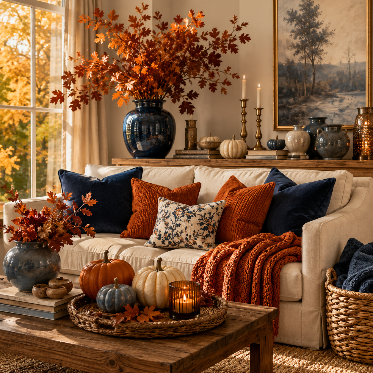
The secret is not simply placing bright blue accessories beside orange pumpkins. The most beautiful rooms use carefully chosen variations of both colors. Think muted navy beside burnt orange, dusty blue paired with terracotta, or deep indigo surrounded by copper, caramel, natural oak, dried foliage, and creamy textiles. 🍂 The combination becomes especially convincing when the colors are supported by natural materials and plenty of warm neutrals.
There are countless ways to experiment with this palette, but three approaches stand out for their balance, versatility, and visual impact. From sophisticated navy and burnt orange to soft dusty blue and terracotta and finally a dramatic botanical interpretation, these are the Best 3 Blue and Orange Fall Decor ideas for creating an autumn home that feels distinctive rather than predictable.
Why Blue and Orange Fall Decor Works So Beautifully
Blue and orange sit opposite one another on the traditional color wheel, which makes them complementary colors. This natural contrast is one reason the pairing immediately catches the eye. Orange feels warm, energetic, earthy, and seasonal, while blue provides a cooler visual counterbalance.
In autumn decorating, this relationship becomes particularly interesting. A room filled entirely with orange, rust, and brown can sometimes become visually heavy. Introducing blue creates breathing space. A navy cushion, faded blue ceramic vessel, indigo textile, or blue-gray wall can make surrounding autumn colors appear richer.
The effect does not need to be bold.
In fact, some of the most sophisticated blue-and-orange rooms use subdued variations of the colors rather than highly saturated versions. Burnt orange looks elegant beside navy. Terracotta feels organic against dusty blue. Copper becomes luminous beside deep indigo.
Natural materials help connect the contrasting colors. Wood, linen, stone, rattan, wool, dried branches, and aged metals create a neutral bridge between blue and orange.
The result is an autumn palette that feels warm but not overwhelming. 🍁
The Best Blue and Orange Fall Decor Color Combinations
Before decorating, choosing the right shades is essential. Bright royal blue and vivid orange can create an energetic contemporary appearance, but they are usually harder to integrate into a sophisticated autumn interior.
Muted and nature-inspired colors are much easier to layer.
| Blue Shade | Orange Partner | Supporting Neutrals | Overall Mood |
|---|---|---|---|
| Deep navy | Burnt orange | Cream, walnut, brass | Sophisticated and luxurious |
| Dusty blue | Terracotta | Linen, oak, ivory | Soft and organic |
| Indigo | Copper orange | Charcoal, warm white, bronze | Dramatic and artistic |
| Slate blue | Pumpkin orange | Greige, natural wood | Cozy and contemporary |
| Blue gray | Cinnamon orange | Beige, stone, taupe | Calm and understated |
The supporting neutrals are almost as important as the main colors. Instead of forcing blue and orange to occupy every surface, allow cream, beige, wood, stone, or warm white to dominate the room.
Blue and orange can then function as carefully placed seasonal accents.
This approach makes the room feel curated rather than themed.
🥇 Best 1 Sophisticated Navy and Burnt Orange Fall Decor
Among all the possibilities, navy and burnt orange blue and orange fall decor may be the most timeless combination. It has enough contrast to create visual drama while remaining elegant enough for sophisticated living rooms, dining rooms, bedrooms, and entryways.
Navy provides depth without the harshness of black. Burnt orange brings the unmistakable warmth of autumn but feels considerably more refined than bright pumpkin orange.
Add cream, natural wood, antique brass, and touches of caramel, and the palette becomes beautifully layered.


Start With a Calm Neutral Foundation
A sophisticated autumn interior usually benefits from a quiet foundation.
Warm white, ivory, pale greige, or creamy beige walls allow navy and burnt orange accents to stand out without making the space feel visually crowded. Natural oak flooring or medium walnut furniture can introduce additional warmth.
Large neutral pieces should generally remain relatively timeless.
For example, a cream linen sofa can become the center of a blue-and-orange autumn living room. Instead of replacing major furnishings seasonally, add navy velvet cushions, burnt orange linen pillows, a warm caramel throw, and perhaps one patterned textile containing several colors from the palette.
This strategy makes seasonal decorating easier because the underlying interior remains flexible.
Use Navy as the Sophisticated Anchor
Navy works especially well on larger decorative elements.
A navy armchair can immediately ground a neutral living room. Deep blue curtains create dramatic vertical color. A navy rug with subtle cream detailing can visually connect an entire seating arrangement.
For a smaller commitment, introduce navy through cushions, ceramic vessels, artwork, books, lampshades, or table linens.
The goal is to create enough blue that it appears intentional.
One isolated blue accessory surrounded by orange decorations can look accidental. Repeating blue in two or three areas gives the room visual continuity.
🔵 Designer trick: repeat approximately the same shade of navy at different heights. A navy rug near the floor, blue cushion at seating height, and dark blue artwork higher on the wall can make the color feel integrated throughout the room.
Layer Burnt Orange Through Textiles
Burnt orange is particularly effective in autumn textiles because fabric naturally softens the intensity of the color.
Consider linen cushions, velvet pillows, woven blankets, wool throws, upholstered stools, or patterned rugs containing restrained orange details.
Texture matters enormously.
A flat orange surface can feel bright and graphic, while burnt orange velvet catches light differently throughout the day. Chunky wool creates shadows that make the color appear deeper. Washed linen gives orange a faded, relaxed character.
Combining several textures prevents the autumn palette from looking one-dimensional.
🍂 A navy velvet pillow beside a burnt orange linen cushion and an oatmeal wool blanket can create more visual richness than a dozen obvious seasonal ornaments.
Introduce Autumn Through Natural Materials
The easiest way to make blue and orange feel genuinely seasonal is to introduce elements from nature.
Arrange sculptural branches in a large navy ceramic vase. Use dried oak leaves, copper-colored foliage, preserved grasses, rose hips, seed heads, or dried hydrangeas.
Pumpkins can certainly be included, but they do not need to dominate the arrangement.
Choose unusual varieties in muted orange, cream, pale green, or dusty peach. Mixing colors creates a more botanical appearance than using identical bright orange pumpkins.
Wooden bowls, woven baskets, stone trays, and handmade ceramics further reinforce the natural character.
Important Note: Avoid dividing the room into obvious blue areas and orange areas. The palette looks much more sophisticated when both colors are repeated subtly throughout the space and connected with neutral materials such as linen, wood, stone, and warm metals.
Add Antique Brass and Warm Metallic Details
Metal can become the finishing element that makes navy and burnt orange feel luxurious.
Antique brass is particularly effective because its golden undertone complements orange while standing beautifully against navy.
Try slender brass candlesticks on a mantel, an aged brass picture frame, a sculptural table lamp, or a simple brass tray.
The key is restraint.
Metallic accents should catch the light rather than dominate the composition.
During autumn evenings, candlelight reflecting from brass beside deep navy textiles and burnt orange foliage creates an exceptionally cozy atmosphere. 🕯️
🥈 Best 2 Soft Dusty Blue and Terracotta Fall Decor
The second approach is considerably lighter.
Dusty blue and terracotta blue and orange fall decor creates an earthy, relaxed interpretation of autumn that works beautifully in Scandinavian, farmhouse, Mediterranean, cottage, transitional, and organic modern interiors.
Instead of strong complementary contrast, this palette feels faded and natural.
Dusty blue resembles misty autumn skies. Terracotta recalls clay, dried leaves, and warm earth. When combined with cream linen, pale oak, woven baskets, and handmade ceramics, the result feels calm and effortlessly seasonal.

Build the Palette Around Dusty Blue
Dusty blue is an excellent choice for anyone who finds navy too dramatic.
Its gray undertone gives it a quiet sophistication.
The color can appear through painted cabinetry, a vintage-style rug, linen cushions, ceramic pottery, upholstered chairs, or faded botanical artwork.
Because dusty blue behaves almost like a neutral, it can be used more generously than stronger blue shades.
Imagine a pale cream living room with a dusty blue rug, light oak coffee table, off-white sofa, and several terracotta accents. The contrast remains visible, but the atmosphere stays serene.
This is particularly effective in rooms with abundant natural daylight.
Bring Terracotta Into Blue and Orange Fall Decor
Terracotta is one of the easiest orange tones to decorate with because it already exists naturally in clay.
Instead of adding orange purely through fabric or painted objects, use actual terracotta materials.
A large handcrafted clay vase can become a focal point. Small terracotta pots can hold dried grasses or autumn branches. Unglazed ceramic bowls introduce warm earthy color without looking overly decorative.
Terracotta also works beautifully in textiles.
Look for cushions and throws in faded clay, cinnamon, paprika, or rust tones rather than saturated orange.
These nuanced colors make the room feel collected over time.
Create a Soft Autumn Sofa Arrangement
The sofa is one of the easiest places to introduce seasonal color.
Begin with a neutral sofa in ivory, beige, oatmeal, or pale gray. Add two dusty blue cushions and one or two terracotta cushions in slightly different fabrics.
Then introduce a cream or camel-colored throw.
Do not arrange everything too perfectly.
Slight asymmetry often creates a more natural editorial appearance. One larger blue cushion can sit behind a smaller patterned pillow while a terracotta throw is casually folded across the opposite side.
A nearby wooden side table with a ceramic lamp and small arrangement of autumn foliage can extend the palette beyond the sofa.
The result feels cozy without becoming cluttered.
Style a Dusty Blue and Terracotta Fall Table
This color combination is especially beautiful for autumn dining.
Begin with a natural linen tablecloth or leave a warm wooden tabletop exposed. Add dusty blue linen napkins and handmade cream dinnerware.
Terracotta can appear through small ceramic bowls, candle holders, or a central vessel.
Instead of creating an oversized floral centerpiece, arrange several low objects along the center of the table.
For example:
terracotta vessels filled with dried foliage, small cream pumpkins, blue-gray eucalyptus, brass candleholders, scattered autumn leaves, and textured linen.
Keeping the centerpiece low makes the dining table feel inviting rather than staged.
🍽️ The combination of earthy pottery and soft textiles gives the arrangement a tactile quality that feels particularly appropriate for autumn entertaining.
Add Woven Texture for Warmth
Dusty blue is cool, so natural fibers help keep the room warm.
Rattan baskets, jute rugs, woven trays, cane furniture, and seagrass accessories introduce golden-brown tones that connect naturally with terracotta.
A large woven basket filled with a folded dusty blue blanket can become part of the color scheme rather than merely practical storage.
Similarly, a jute rug beneath a dining table helps visually warm blue textiles.
The goal is not to add more colors but to create a richer range of natural textures.
🥉 Best 3 Dramatic Botanical Blue and Orange Fall Decor
The third approach is for anyone who wants autumn decorating to feel more artistic.
Instead of relying heavily on pumpkins and traditional seasonal accessories, dramatic botanical blue and orange fall decor uses foliage, flowers, branches, ceramics, and sculptural natural materials to create an immersive autumn composition.
Deep indigo, slate blue, copper, rust, cinnamon, and amber become the dominant colors.
The result can feel like an elegant autumn garden brought indoors. 🌿🍂

Create a Statement Autumn Branch Arrangement
One dramatic arrangement can sometimes have more impact than many small decorations.
Choose a large ceramic vessel in navy, indigo, or blue-gray and fill it with tall seasonal branches.
Japanese maple branches, oak leaves, beech foliage, rose hips, crabapple branches, or dried seed heads can create spectacular silhouettes.
Look for foliage containing rust, copper, orange, burgundy, and faded green rather than one uniform color.
Allow branches to extend asymmetrically.
A loose arrangement feels more natural and architectural than a compact bouquet.
Place it on an entry console, dining table, kitchen island, or fireplace hearth where its shape has enough space to be appreciated.
Layer Blue Ceramics With Copper Foliage
Blue ceramics create an ideal background for warm autumn botanicals.
Combine several vessels in related but slightly different tones: deep navy, indigo, faded denim blue, and blue-gray.
Vary their heights and shapes.
One vessel might hold tall branches, another a compact collection of dried hydrangeas, while a smaller bowl contains miniature pumpkins or acorns.
Warm foliage will appear particularly vivid against these cooler surfaces.
The effect becomes even stronger when the arrangement sits against a warm white, plaster, stone, or natural wood background.
This is an excellent approach for consoles and mantels because it creates seasonal drama without requiring novelty decorations.
Design a Blue and Orange Fall Mantel
A fireplace mantel offers an ideal stage for this palette.
Begin with one dominant artwork or mirror. If possible, choose artwork containing blue, gray, or atmospheric landscape tones.
Place a large blue ceramic vessel on one side and fill it with copper-colored branches.
Balance it with several smaller objects on the opposite side, such as antique brass candlesticks, miniature pumpkins, books, or handmade pottery.
Instead of making the arrangement perfectly symmetrical, allow one side to rise higher.
This creates movement.
A garland can be incorporated, but keep it loose and botanical. Eucalyptus, dried oak leaves, vines, and subtle orange berries are more sophisticated than a dense artificial garland.
🔥 Once the fireplace is lit, the orange foliage and warm metallic details become even more luminous against the blue accents.
Use Pumpkins in Unexpected Colors
Pumpkins remain one of autumn’s most recognizable decorating elements, but they can be used differently.
Instead of buying only classic orange pumpkins, combine:
- deep orange pumpkins
- muted terracotta pumpkins
- creamy white pumpkins
- blue-gray pumpkins
- pale green heirloom pumpkins
Blue-gray pumpkin varieties can become a natural bridge between the two main colors.
Arrange them in irregular groups rather than straight lines.
Three or five pumpkins in different sizes usually look more natural than a large collection of identical pieces.
Place them alongside branches, moss, leaves, or stoneware to create a miniature autumn landscape.
Bring Blue and Orange Fall Decor Into the Entryway
An entryway offers an opportunity to introduce the color story immediately.
A navy or blue-gray console can become a dramatic foundation. Alternatively, keep the furniture natural wood and introduce blue through a large ceramic vase.
Fill the vase with orange and rust-colored branches.
Add a woven basket underneath the console and perhaps a small group of heirloom pumpkins nearby.
Above the console, choose a large mirror or autumn landscape artwork.
The composition should have a strong vertical element, a grounded horizontal element, and smaller decorative details.
This creates a more professional-looking arrangement.
A small lamp with warm illumination can make the entry particularly inviting during darker autumn evenings.
Decorating the Living Room With Blue and Orange
A living room does not need to become completely seasonal.
Instead, identify several high-impact areas.
The sofa provides textile opportunities. The coffee table offers space for a small arrangement. A fireplace or console can hold larger botanical displays.
Repeat the palette carefully between these zones.
For example, a navy cushion on the sofa can visually connect with a navy ceramic vessel across the room. A burnt orange blanket can echo copper foliage on the mantel.
This repetition makes the entire room feel cohesive.
Keep approximately half or more of the visual field neutral. Cream walls, wood furniture, neutral upholstery, and natural flooring give stronger colors somewhere to breathe.
Blue and Orange Fall Decor for the Bedroom
Autumn bedroom decorating should generally feel quieter than living-room decorating.
Instead of introducing many decorative objects, focus on textiles.
A navy upholstered headboard can create a permanent sophisticated anchor. Layer the bed with ivory sheets, a warm beige duvet, burnt orange cushions, and perhaps a deep blue throw.
For a softer variation, use dusty blue bedding with terracotta lumbar pillows.
Add one ceramic vase containing dried foliage to a dresser or bedside table.
Warm bedside lighting is especially important.
Soft amber illumination makes orange textiles glow while preventing blue fabrics from feeling cold.
🛏️ The finished room should suggest autumn through warmth and texture rather than obvious seasonal symbols.
Create a Blue and Orange Fall Porch
The palette can also move outdoors.
A deep navy front door provides an excellent background for orange foliage and pumpkins.
Arrange terracotta pots, heirloom pumpkins, ornamental grasses, and autumn branches around the entrance.
A wreath can combine dried orange leaves with blue-gray eucalyptus or preserved foliage.
For seating areas, use navy outdoor cushions with rust or terracotta accent pillows.
Add warm lanterns for evening atmosphere.
The natural greens, browns, and stone colors surrounding an outdoor space automatically help balance the blue-orange contrast.
Materials That Make the Palette Feel Expensive
Color alone does not determine whether a room feels luxurious.
Materials play an equally important role.
For sophisticated blue and orange fall decor, prioritize tactile, authentic surfaces.
Natural linen introduces relaxed texture. Velvet creates depth. Wool provides softness. Oak and walnut add warmth. Handmade ceramics bring irregularity and character.
Stone provides visual weight.
Metals such as antique brass, aged bronze, and copper introduce subtle autumn luminosity.
Avoid filling the room with glossy plastic seasonal decorations. Even an inexpensive natural branch arrangement can look more elevated than numerous synthetic accessories when it is displayed thoughtfully.
Quality of composition matters more than quantity of objects.
How to Keep Blue and Orange Fall Decor From Looking Too Bright
The easiest solution is to mute at least one side of the palette.
If orange is relatively vivid, choose navy or slate rather than bright cobalt blue.
If blue is strong, use terracotta, rust, or burnt orange rather than brilliant pumpkin orange.
Neutrals should separate the strongest colors.
For example, instead of placing a bright orange pillow directly beside a strong blue pillow, introduce a cream or patterned neutral cushion between them.
Lighting also changes how these colors behave.
Warm evening light softens blue and enhances orange. Cool daylight can make the contrast appear stronger.
This is why natural textures and warm lighting are particularly helpful.
Small Blue and Orange Fall Decor Details That Make a Big Difference
A complete room makeover is unnecessary.
Sometimes a few carefully chosen details can establish the entire palette.
Try changing cushion covers, adding one seasonal throw, replacing summer flowers with autumn branches, introducing a blue ceramic vase, or styling a bowl with miniature pumpkins.
Books can also contribute color.
A stack of blue-gray books beneath a terracotta bowl creates subtle layering. Artwork containing muted blue landscapes can remain year-round while seasonal orange foliage changes around it.
Candles are another easy addition.
Choose ivory candles rather than orange ones and place them in brass or dark metal holders. The flame itself already provides the warm orange element.
This keeps the composition elegant.
Choosing Between the Best 3 Blue and Orange Fall Decor Ideas
Each of the three approaches creates a different autumn mood.
🥇 Navy and burnt orange is the strongest option for a sophisticated, timeless interior. It works especially well with velvet, walnut, antique brass, cream upholstery, and dramatic evening lighting.
🥈 Dusty blue and terracotta is ideal for a softer, more organic home. It pairs beautifully with pale oak, linen, woven baskets, pottery, and relaxed Scandinavian or farmhouse styling.
🥉 Botanical indigo and copper is the most artistic approach. It focuses on dramatic branches, seasonal foliage, blue ceramics, sculptural arrangements, and layered natural materials.
There is no need to follow only one interpretation.
A home might use navy and burnt orange in the living room while introducing dusty blue and terracotta in the dining room. Botanical arrangements can connect both spaces.
Consistency comes from repeating materials and related color tones rather than making every room identical.
Final Thoughts on Blue and Orange Fall Decor
The appeal of blue and orange fall decor comes from contrast. Orange captures the warmth, foliage, candlelight, and earthy richness associated with autumn, while blue introduces depth and a refreshing sense of sophistication.
The combination becomes especially beautiful when neither color is treated too literally.
Instead of bright blue and standard pumpkin orange, explore navy, dusty blue, indigo, slate, terracotta, rust, copper, cinnamon, and burnt orange. Layer those colors with cream linen, warm wood, stone, woven fibers, handmade pottery, antique brass, and natural autumn foliage.
For the most timeless result, 🥇 sophisticated navy and burnt orange is difficult to beat. For a lighter and more relaxed home, 🥈 dusty blue and terracotta creates an exceptionally inviting atmosphere. And for an interior that feels dramatic and editorial, 🥉 botanical indigo and copper turns autumn decorating into something closer to seasonal art.
Most importantly, autumn does not need to mean covering every surface with pumpkins.
A few beautifully selected objects can communicate the season more effectively: one spectacular branch arrangement, a rich burnt orange textile, a deep blue ceramic vessel, warm candlelight, and several natural textures.
🍁 When these details are layered thoughtfully, blue and orange stop feeling like competing colors and begin working as a sophisticated autumn partnership—warm and cool, energetic and calm, familiar and unexpected at the same time.
Related posts:
Best 3 Floral Painted Pumpkin Ideas That Will Make Your Fall Decor Look Absolutely Stunning
Best 3 October Dry Erase Calendar Ideas That Make Your Fall Home Look Beautiful and Organized
Top 3 90s Fall Decor Ideas That Make Your Home Feel Warm Nostalgic and Expensive
Top 3 Dollar Tree Stacking Pumpkins Ideas That Look Shockingly Expensive
Top 3 Fall Bathroom Decor Ideas That Make Your Space Look Expensive
Top 3 Fall Dough Bowl Ideas That Make Your Home Look Effortlessly Cozy

